 "Gamecat235" (Gamecat235)
02/13/2014 at 12:51 • Filed to: Kinja, New Kinja, kinja help
 3
3
 50
50|
"Gamecat235" (Gamecat235)
02/13/2014 at 12:51 • Filed to: Kinja, New Kinja, kinja help | 3
| 50 |
Want to preview it? (
Edit, to contain feedback, let's use this post to collect feedback for now
)
Add ?tiger to the end of a url for any of the Gawker sites (ex:
!!!error: Indecipherable SUB-paragraph formatting!!!
) and that site will change to 1.2 until you use ?tiger=off to change back. More information over on Crosstalk
!!!error: Indecipherable SUB-paragraph formatting!!!
.
!!! UNKNOWN CONTENT TYPE !!!
 Arch Duke Maxyenko, Shit Talk Extraordinaire
> Gamecat235
Arch Duke Maxyenko, Shit Talk Extraordinaire
> Gamecat235
02/13/2014 at 12:57 |
|
Crouching Tiger, Hidden Kinja.
 Arben72
> Gamecat235
Arben72
> Gamecat235
02/13/2014 at 12:57 |
|
It would be nice on mobile to switch back to Jalopnik, otherwise I like the lay out. Now I'm waiting for the glitches...
 Aya, Almost Has A Cosmo With Toyota Engine Owned by a BMW.
> Gamecat235
Aya, Almost Has A Cosmo With Toyota Engine Owned by a BMW.
> Gamecat235
02/13/2014 at 12:58 |
|
I sorta like it. Matches with my windows 8 modern ui.
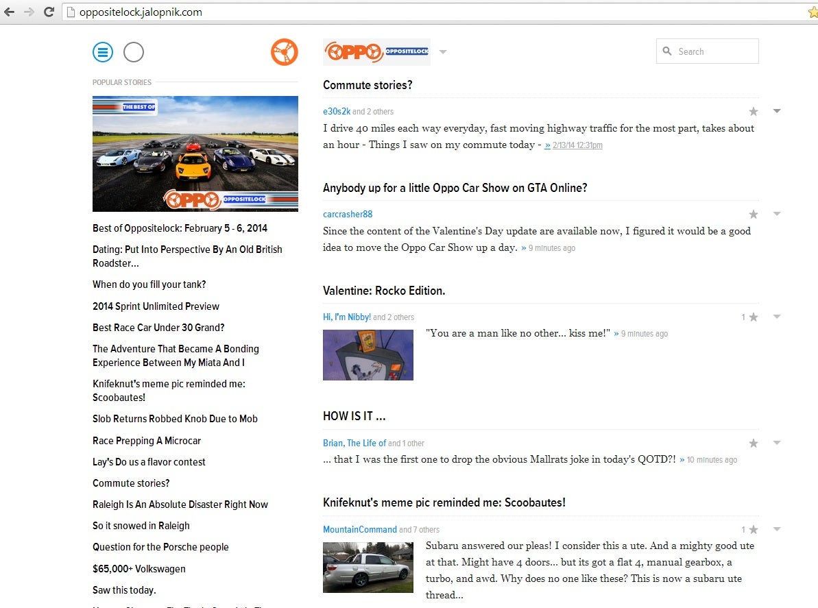
 Tom McParland
> Gamecat235
Tom McParland
> Gamecat235
02/13/2014 at 12:58 |
|
Interesting, I like the image above the "most read" story. I think just the circle logo and not "Oppositelock" above the left column is awkward.
 twinturbobmw
> Gamecat235
twinturbobmw
> Gamecat235
02/13/2014 at 12:58 |
|
Just previewed it. I think there needs to be a better separation between discussions if that makes sense. You should be able to tell between each comment with its replies on a thread.
 505Turbeaux
> Gamecat235
505Turbeaux
> Gamecat235
02/13/2014 at 12:59 |
|
who is beta testing this iteration? I do a whole lot of web design and testing and this doesnt look out of alpha even. I would be happy to throw my hat in the ring to help if you want to put me in touch with whomever is handling the dev
 carcrasher88
> Gamecat235
carcrasher88
> Gamecat235
02/13/2014 at 13:00 |
|

Hey, I'm famous!
All joking aside, that's pretty interesting looking. Pics could be a bit bigger, but the overall layout looks a little better.
|
Gamecat235
> 505Turbeaux
02/13/2014 at 13:01 |
|
It's live on Valleywag... and well, leave feedback on this post for now and I'll let Ernie and team know we have some folks who are pounding on it here.
 JQJ213- Now With An Extra Cylinder!
> Gamecat235
JQJ213- Now With An Extra Cylinder!
> Gamecat235
02/13/2014 at 13:02 |
|
I like the look on the front page... it is clean and well thought out. However, the comments are a bit too messy. It is hard to tell them all apart. Otherwise, I do like it. Like, look here on my earlier post with over 100 comments... look how much scrolling you need. It isn't good for this.
!!! UNKNOWN CONTENT TYPE !!!
|
505Turbeaux
> Gamecat235
02/13/2014 at 13:03 |
|
I'll poke into it a little later. Thanks!
|
Gamecat235
> Tom McParland
02/13/2014 at 13:04 |
|
Favorite part. A visual indicator of following. HEARTS ARE BACK!!!! (as checkboxes)
 MountainCommand
> Gamecat235
MountainCommand
> Gamecat235
02/13/2014 at 13:04 |
|
Wasnt this whole inline (down, inline) thing like it was way before the 5.0 change. When we had the "show replies" button?
Well, i guess its hopefull we might be back to the way it was a few years back then.
|
Tom McParland
> Gamecat235
02/13/2014 at 13:06 |
|
That is a cool feature, because I always forget who I follow and who I don't.
|
Tom McParland
> Gamecat235
02/13/2014 at 13:09 |
|
What is this "profile" thing? When I mouse over your avatar I get two options "profile" and "unfollow." If I click "profile" it just opens another conversation window.
|
Gamecat235
> Tom McParland
02/13/2014 at 13:10 |
|
I believe it *should* open up the link to your kinja account, but I'm not positive. That's a rather good question.
|
505Turbeaux
> Gamecat235
02/13/2014 at 13:12 |
|
for starters from design aspect, not useability, oppo wheel on top left is clipped off at bottom of wheel on W8 Opera 18 and ffox 26. 1920x1200 res
oppo logo with grey background looks like it should be on white. IMHO a large header with background would be much more appealing
when I drag the browser windows in to test responsive design at tablet res, search disappears, as do all smaller post photos. blue menu button floats over avatars. In tablet and smaller I think this should float on upper right hand corner. More to come
|
Tom McParland
> Gamecat235
02/13/2014 at 13:15 |
|
If I click your name it takes me to your blog as usual, but "profile" just gets me another comment window. It would be nice to have "profile" pages that people could access.
|
Gamecat235
> Tom McParland
02/13/2014 at 13:17 |
|
Future functionality perhaps? I'm not sure... "Profile" is very defined in Kinja, so I'm not sure exactly what that is meant to do.
|
Gamecat235
> 505Turbeaux
02/13/2014 at 13:19 |
|
The oppo logo at one point was transparent, it looks like it no longer is. We can change that in the png file. Mobile functionality has been wonky on VW (valleywag) for a bit, but they have been resolving issues quickly.
|
505Turbeaux
> Gamecat235
02/13/2014 at 13:23 |
|
yeah I didnt even see filetype on the logo, figured it may have been a placeholder jpg.
I think that header area has crazy whitespace in it, just my opinion though. Certainly makes the posts pop a bit more. top stories photo I think makes it look off balance. I will keep popping into it today in between another auto site I have under dev :)
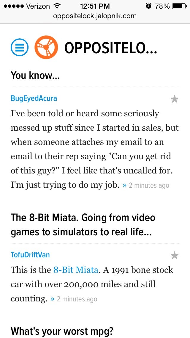
 Tim (Fractal Footwork)
> Gamecat235
Tim (Fractal Footwork)
> Gamecat235
02/13/2014 at 13:30 |
|
The pictures are gone on mobile! Boooooo!
 KnifeKnut
> Gamecat235
KnifeKnut
> Gamecat235
02/13/2014 at 13:31 |
|
Pictures Too small on FP, too big in comments, and too much scrolling is made necessary in the new comments. The multithreaded nature of Oppo and Jalop comments just does not lend itself well to that format. Also FP is too spread out, I like the stories to be a little closer for less scrolling.
|
Gamecat235
> 505Turbeaux
02/13/2014 at 13:34 |
|
Awesome feedback. I'm sure it will be appreciated. I like a lot of the aesthetics, but some of the other stuff is a bit wonky... but it's still in somewhat of a beta. I put this out there as a post because with the information out there already, I wanted to try to somewhat control it. =)
|
Gamecat235
> Tim (Fractal Footwork)
02/13/2014 at 13:34 |
|
Screenshot? I'm REALLY curious what you mean.
|
Gamecat235
> KnifeKnut
02/13/2014 at 13:36 |
|
I think that the picture size didn't seem to change much (if at all)... but that may be a browser to browser type thing.
Bear in mind that while it's live on Product and Valleywag, it is being tweaked... Also, see Nick Denton's posts over on Product here:
http://product.kinja.com/
They're quite interesting.
|
Gamecat235
> MountainCommand
02/13/2014 at 13:37 |
|
Yeah, there are some things that hark back to previous versions. It's interesting... But some of this functionality is intentional.
See Nick Denton's two recent pieces on Product over here:
http://product.kinja.com/
|
505Turbeaux
> Gamecat235
02/13/2014 at 13:38 |
|
oh no doubt. I would love to guide the design process a bit, but that likely isn't in the cards. My main thing is to make sure it functions correctly so we dont have to endure a days worth of "Kinja sucks" posts when the switch gets flipped on this design :)
|
Gamecat235
> 505Turbeaux
02/13/2014 at 13:45 |
|
The last time we underwent a seriously major aesthetic redesign, someone from Oppo (I don't remember who) actually had some mockups and design ideas with detailed feedback which actually was at least partially taken into account, so the feedback has the potential to reach that group, if it's something that they are open to / looking for. Which they may, or may not be. But the usability testing, that's gonna be key for a successful changeover without the usual bitching
|
505Turbeaux
> Gamecat235
02/13/2014 at 13:50 |
|
Cool, good to know. I spend most of my time here on OPPO, so that is what I am most concerned about. I know there is some leeway to design differences between the Gawker properties, so maybe I will mock a few things up. I was going to screenshot all of my issues with feedback too, but didnt want to muddy your post up too much with suggestions and images. Thanks man
|
Tim (Fractal Footwork)
> Gamecat235
02/13/2014 at 13:52 |
|
On the main page
|
KnifeKnut
> Gamecat235
02/13/2014 at 13:52 |
|
Well it cut off the bottom of the image for my Late night end of the internet post.
 . .
> Gamecat235
. .
> Gamecat235
02/13/2014 at 13:55 |
|
It's OKish apart from the comments system. That's just completely unfit for Oppo.
|
Gamecat235
> 505Turbeaux
02/13/2014 at 13:56 |
|
No Problem... FYI - Updated the logo to a transparent png file.
|
Gamecat235
> Tim (Fractal Footwork)
02/13/2014 at 13:57 |
|
Whoa... that's wild.
 Slave2anMG
> Gamecat235
Slave2anMG
> Gamecat235
02/13/2014 at 13:59 |
|
Not impressed. At all. A lot of white space, not enough delineation between the post and comments, and I've really REALLY come to like seeing the first 2-3 replies to a comment. If nothing else, the number of comment replies needs to put next to the 'seem more' bubble.
And the 'front' page is a truly jumbled unreadable mess...it's horrific. What's up with the picture sizes? What's up with the lack of number of comments? I'll grant you that it's all better than the first iteration of Nu Kinja but a sharp stick in the eye was better than that first miserable iteration.
TL:DR - One hot mess.
|
505Turbeaux
> Gamecat235
02/13/2014 at 14:00 |
|
just curious, is the "compose" button hidden because the content uploader isnt ready yet? Or is it just in a weird spot. Make me have a d'oh moment here
|
Gamecat235
> 505Turbeaux
02/13/2014 at 14:03 |
|
Hard to say... I think it's just moved to the first set of dropdowns... works fine for me (first circle on the uppermost left part of page).
|
505Turbeaux
> Gamecat235
02/13/2014 at 14:05 |
|
aha, when I moused over that it just looked like a link to my blog, but that was the first place I looked. OK D'oh thanks!
 Victorious Secret
> Gamecat235
Victorious Secret
> Gamecat235
02/13/2014 at 14:30 |
|
When it comes to comments. Why do we need to click so much? Why aren't there more defined boundaries between each string of comments? It all sort of blurs together with no definable separation.
Look guys, I know you want to make something better. I don't know if I'd call this better. I'd call this sideways and a few degrees down.
I can't believe I'm saying this but at this point I'd rather take reddits commenting system...That is functional madness. This is just madness.
Copypasta from my other thread, because I didn't see this thread, because shenanigans.
|
Victorious Secret
> Gamecat235
02/13/2014 at 14:30 |
|
I'm hearting every single one of you old farts now.
 Supreme Kiwi Zorro
> Gamecat235
Supreme Kiwi Zorro
> Gamecat235
02/13/2014 at 14:37 |
|
I can't see a bloody thing in the commenting section except comments and avatars. Discuss and reply buttons are now invisible. I'm going to address this in a post on my personal blog. The Kinja IT team will listen to feedbacks that are addressed to them directly.
 CobraJoe
> Gamecat235
CobraJoe
> Gamecat235
02/13/2014 at 14:41 |
|
I really dislike the way it hides all replies to a comment.
That's really the best thing about the current setup, you can see if someone has been replied to with what you were going to say. It stops a bunch of people replying with the same comment.
Also, I rather like the dual column setup instead of the single column, and some better division between the article and comments, and separate comments would be nice.
 Jonee
> Gamecat235
Jonee
> Gamecat235
02/13/2014 at 14:47 |
|
The new comment system confuses me. I keep clicking to see replies and then eventually, I'm totally lost. I'm sure I'll get used to it, like I did this current version. But, as soon as I do, it'll change again. I get tweaking something until you get it right, but why completely revamp every 9 months, or whatever? It's just annoying.
 Roberto G.
> Gamecat235
Roberto G.
> Gamecat235
02/13/2014 at 14:56 |
|
!!! UNKNOWN CONTENT TYPE !!!
 Ernie @ Kinja
> 505Turbeaux
Ernie @ Kinja
> 505Turbeaux
02/13/2014 at 14:56 |
|
If you're serious about guiding the design process and have the necessary skills you should apply for a job here .
|
505Turbeaux
> Ernie @ Kinja
02/13/2014 at 15:04 |
|
I certainly have the skills. I have to check on the relevance to my current non-disclosure agreement but you might see a resume pop through in short order. Currently Director of Digital Marketing in the automotive retail vertical but I think it wouldn't be a parallel switch. Heck I am not even that far from NY! Thanks for the link!
 Mercedes Streeter
> Gamecat235
Mercedes Streeter
> Gamecat235
02/13/2014 at 15:26 |
|
I first clicked on new Kinja some weeks ago when it gave me the option to. I hated it. So, since it will be a part of our daily lives soon, I clicked on it again today just for giggles. Much improved.
I like the new Kinja better than the old. Pictures load instantaneously rather than an hour after you've read an article.
Obviously, I'd much prefer the old commenting system (where you'll see a thread and a few replies) but if this new one means less people will be in the gray, I'm all for it!
|
Ernie @ Kinja
> 505Turbeaux
02/13/2014 at 15:34 |
|
Let me know once you've sent it through.
|
505Turbeaux
> Ernie @ Kinja
02/13/2014 at 15:36 |
|
got it, thanks again
 deekster_caddy
> Gamecat235
deekster_caddy
> Gamecat235
02/18/2014 at 13:05 |
|
More feedback - I noticed a couple of things while browsing comments.
1) the comment preview seems to be cut off at a certain character count rather than by lines displayed or whatever. Seems to short and sometimes an awkward cutoff (like you think you read the whole comment but really there were a few paragraphs after the cutoff). There isn't a 'more' button visible
2) When I scroll to the bottom of the comments and see "Click to see all 42 comments" (or whatever the exact text is there) it then shows me all of the comments I just finished scrolling through. Seems like something is a bit off there. I can see if some are 'buried in gray' that become exposed, but it seems like there wasn't anything buried.